The Road Home
Overview:
UX/UI Volunteer developed a study report with recommendations that the organization has chosen to modify the website.
Website Goals:
Think Aloud Process
Post-Task Survey
Product Reaction Cards
SUS Post-Test Questionnaire
Tree Testing
Usability Test Methods:
Make minimal changes to the website.
Improve website accessibility for people to make donations (items & money).
Improve website accessibility for people with diverse backgrounds.
Story
My colleagues and I conducted a usability test to observe how participants interacted with The Road Home website on both computers and mobile devices. We gave the participants various scenarios that were designed to test the website's overall design, layout, and interactivity. Through this test, we gathered both qualitative and quantitative data to gain a better understanding of the website's prevailing issues and to provide the best possible recommendations for resolving them. Our team's goal is to make minimal changes to the website since most of the time the problems are not deep down, but the problems just lie beneath the surface.
Problem and Solution:
Problem:
Out of 21 participants, 15 had trouble finding donation locations for their stuff. 4 participants took longer than usual to find the locations. (4 Out of 21 participants had “English” as their secondary language.)
Solution:
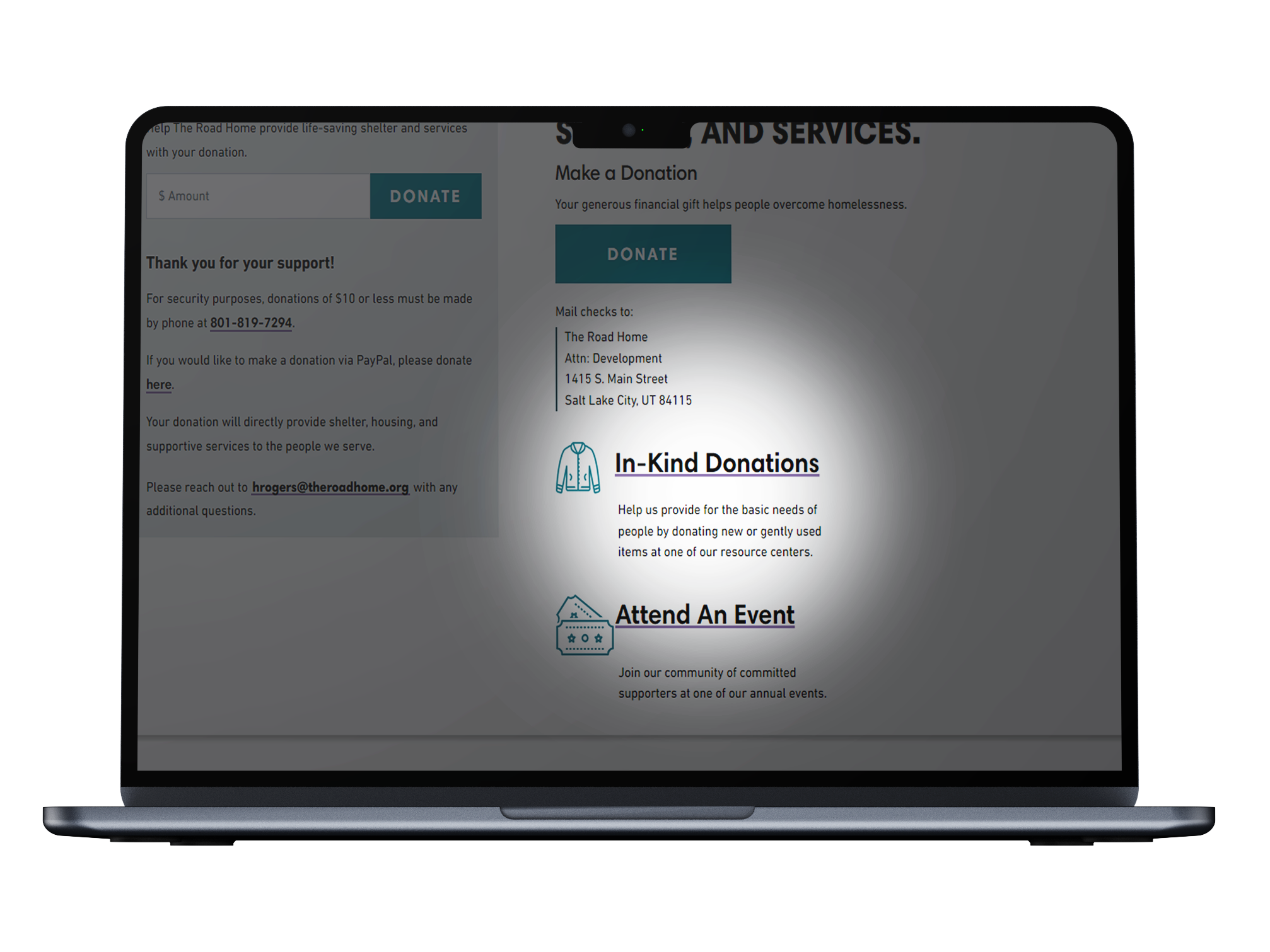
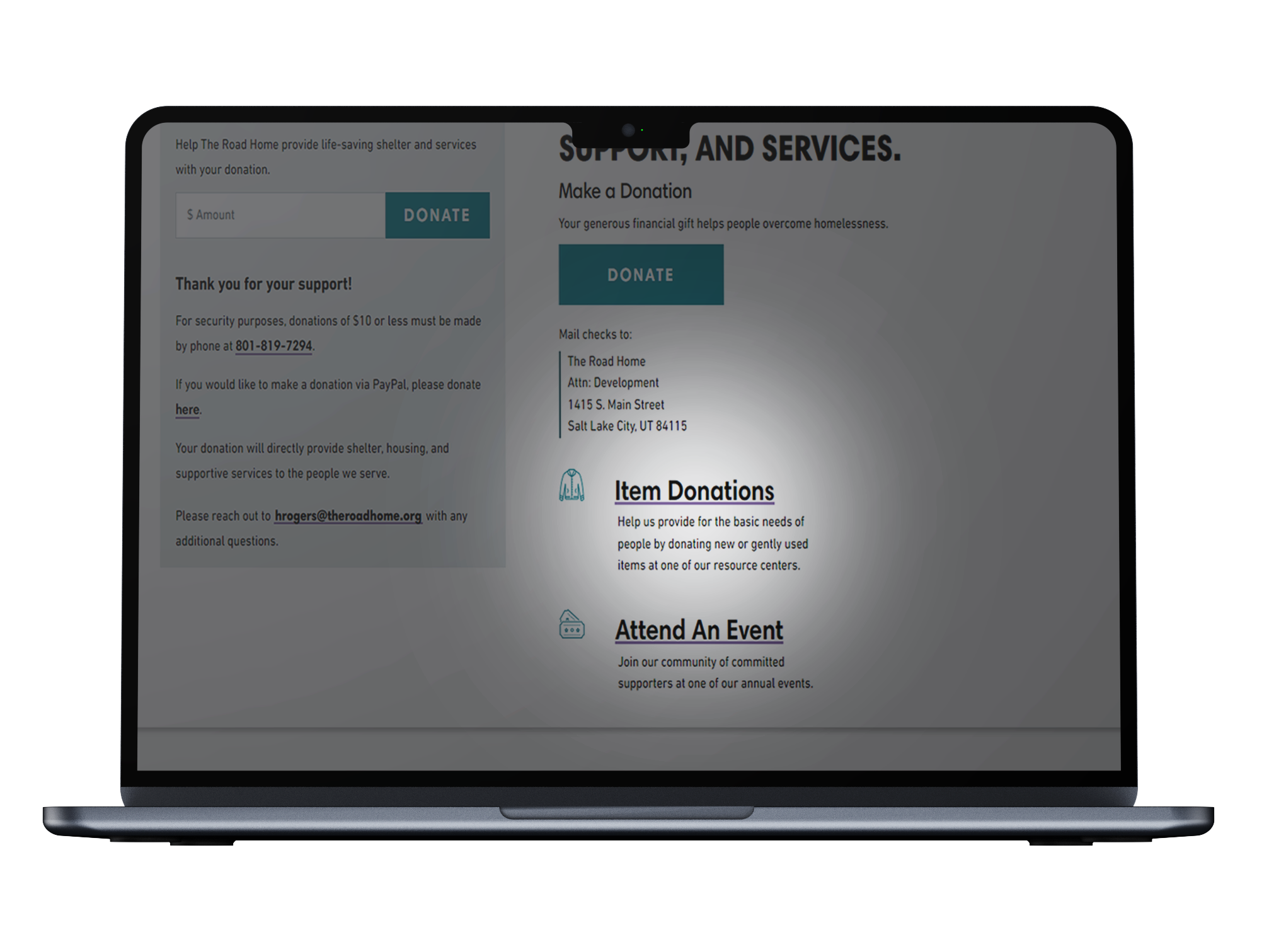
A charity website should have an easily accessible "donating" section and the organization did, but the organization's use of the term "In-Kind donation" made it difficult for users to locate. Our team recommended changing the wording to "item donation," resulting in a successful and minor change that allowed participants to quickly find where to donate their items
Before
After
Problem:
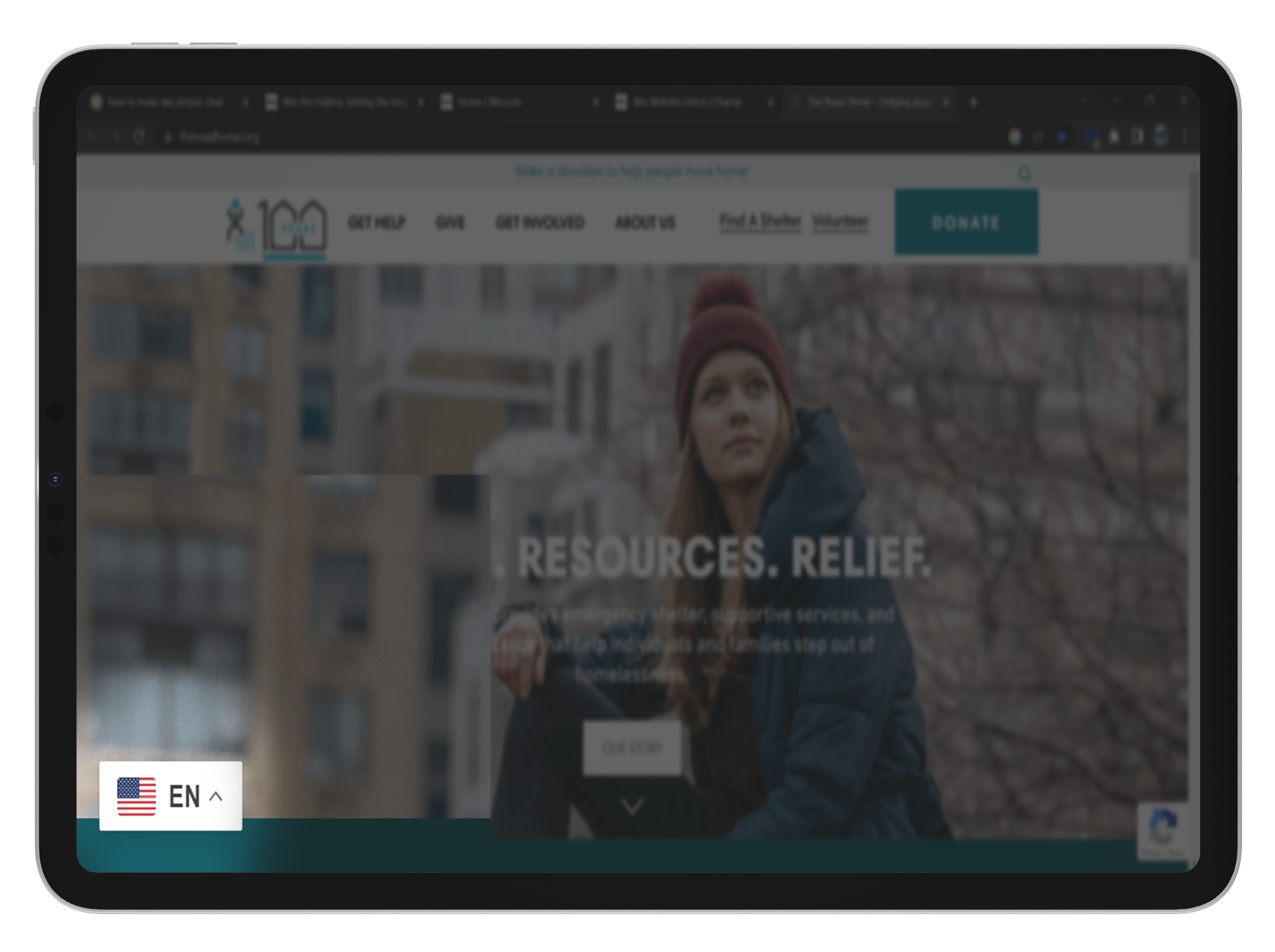
During our testing, we had participants with diverse backgrounds. It was discovered that there are no built-in options for translating the website without using a translator extension. And most participants were not familiar with how to enable this extension, especially on mobile devices.
Solution:
We observe that for most participant when they get their scenarios of finding a language button, their eyes tend to look either top right or bottom left of the screen. This is where we recommend the organization to put their “translate" button.


