The University of Utah
Degree Audit
Overview:
This project started when I wanted to practice my Figma skills in my free time. I noticed that all of my friends hated the fact that as students, we had to go through three or more tabs to enroll in a class. So, I decided to find and design a possible solution for this problem and create a new version of the University of Utah Degree Audit where students only need one tab to know what classes they need to take and to enroll in those classes.
Website Goal:
Students can track their college progress and easily enroll in classes required for graduation.
The website should consolidate all important information from the previous three pages into a single page.
The website should be visually appealing and use design aspects to reduce large blocks of text.
Old Version Problems
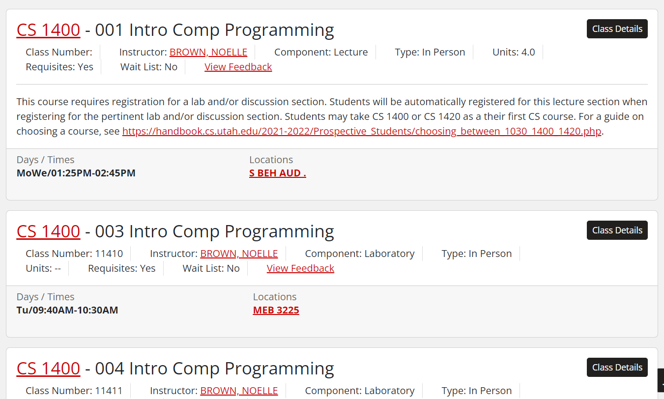
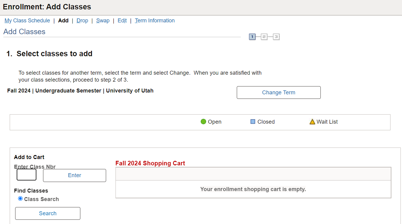
Huge Amount of Tab Requirements: Each student needs at least three tabs to enroll in a class. Degree Audit: To monitor their academic progress and identify required courses for graduation, Course Information: To view class availability for the current semester. Enrollment: Where students manually input course numbers from the Course Information tab to register for classes.
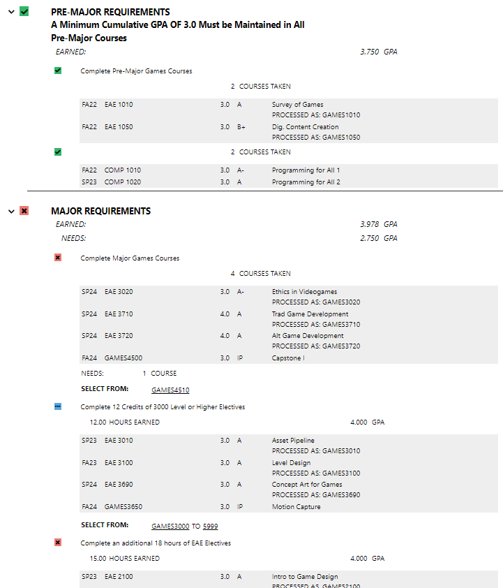
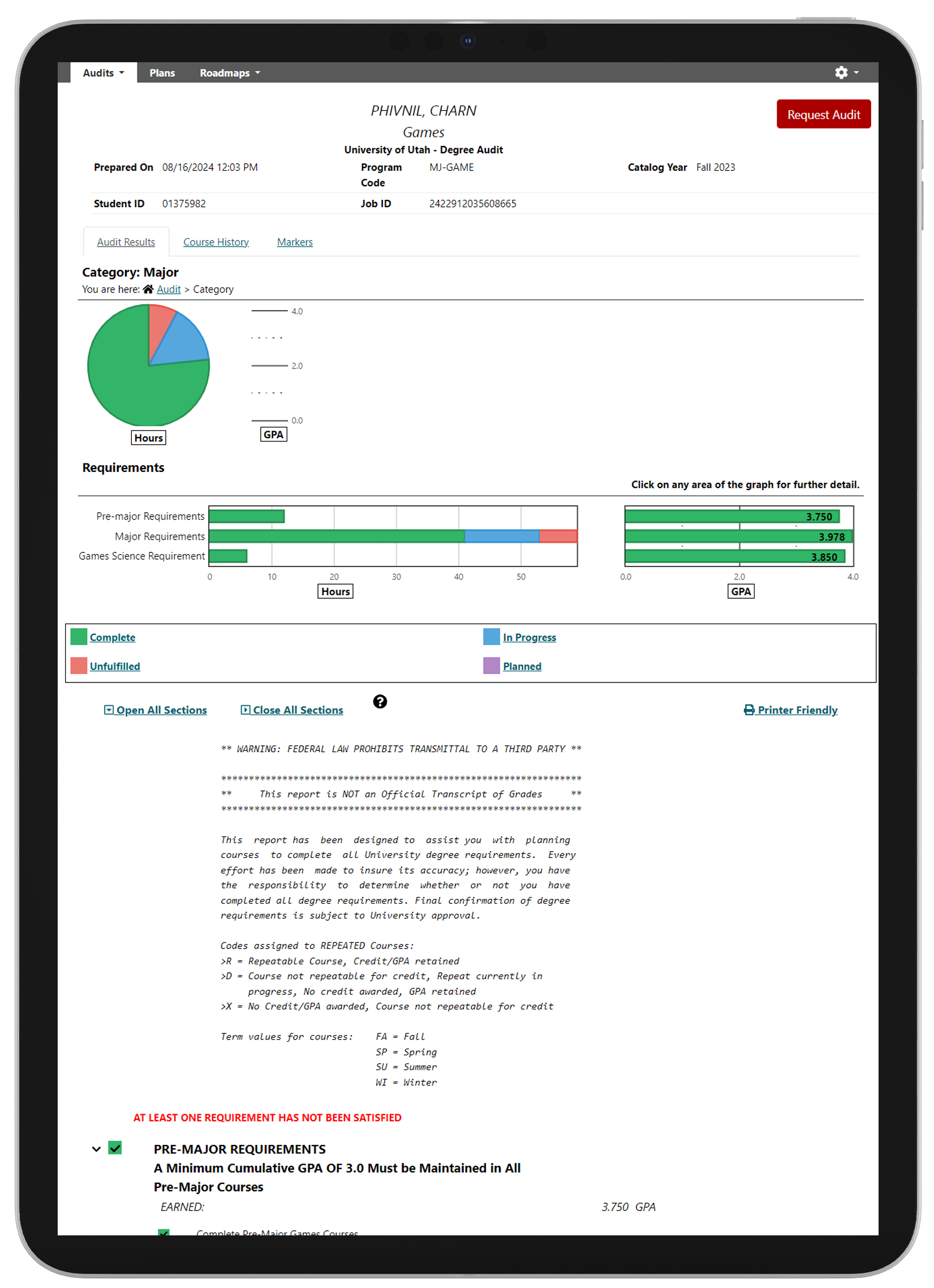
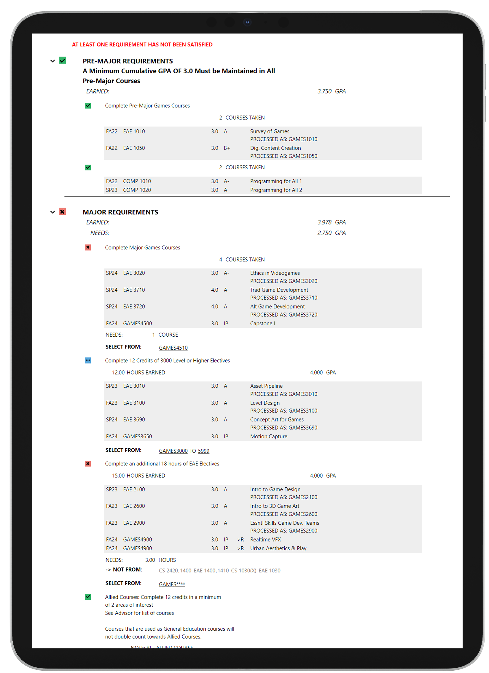
Complexity of Degree Audit: The degree audit interface is overly complex.
Psychological Impact of Progress Bar: Students’ progress bar displays a large amount of red (especially when they are in their first year), which makes the student feel distant from achieving their graduation goals.
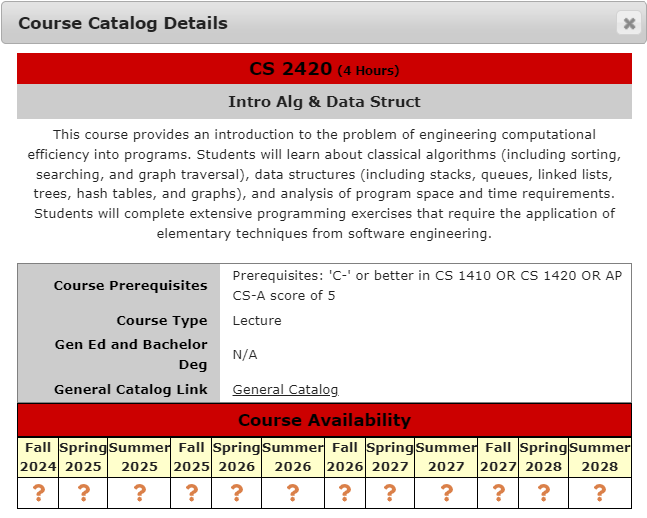
Unnecessary Information: Displaying course availability for up to 10 semesters in advance is unnecessary, as most students focus on the current or upcoming semester.
New Version Solution
Degree Audit
+
Course Information
+
Enrollment
=
Problem: Huge Amount of Tab Requirements
The solution is simple: just decrease the number of tabs! However, there's more to it than that. I need to find a way to include all the important information from the three tabs into one. I've decided to use Degree Audit as the main tab and collapse the other two into this one because I feel that without this tab, the student cannot proceed to any other tab.
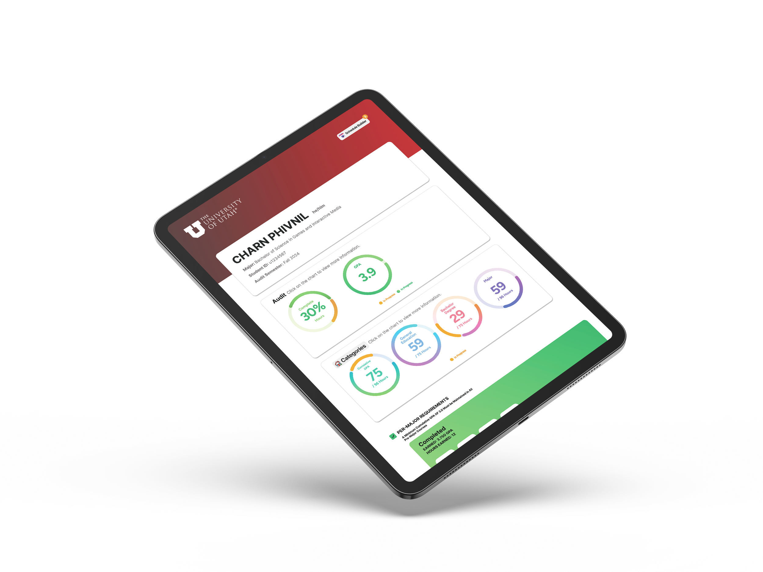
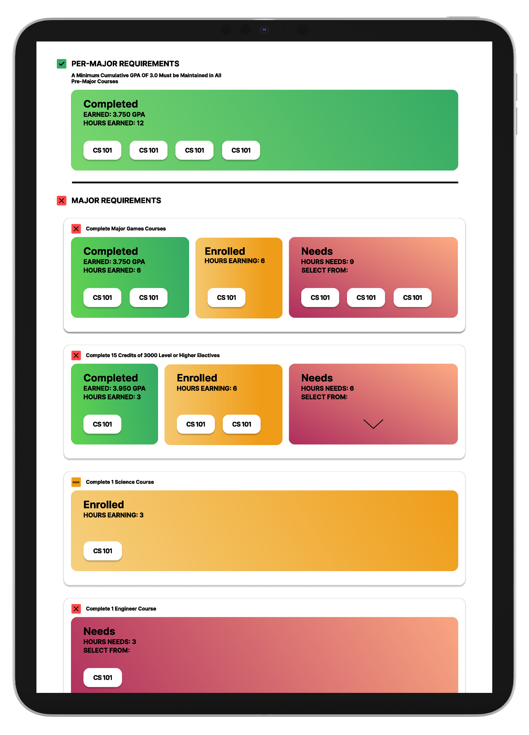
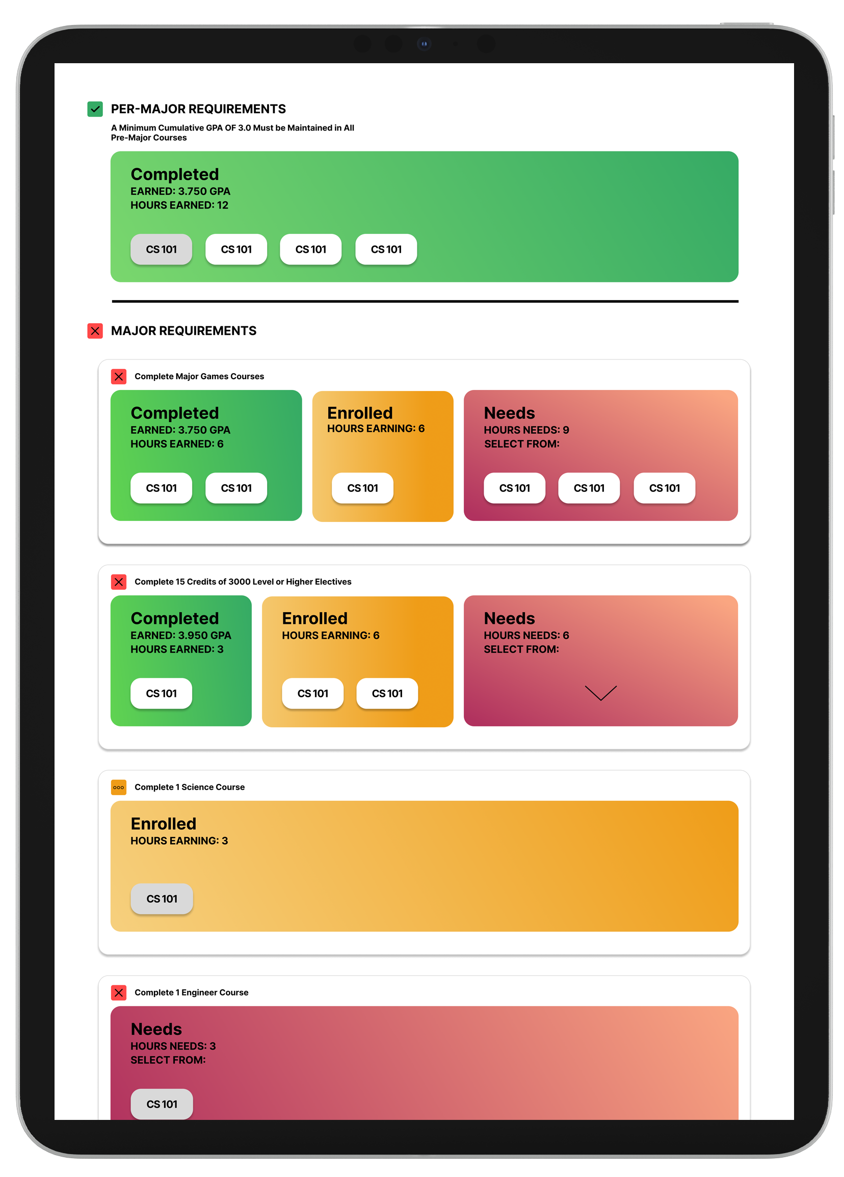
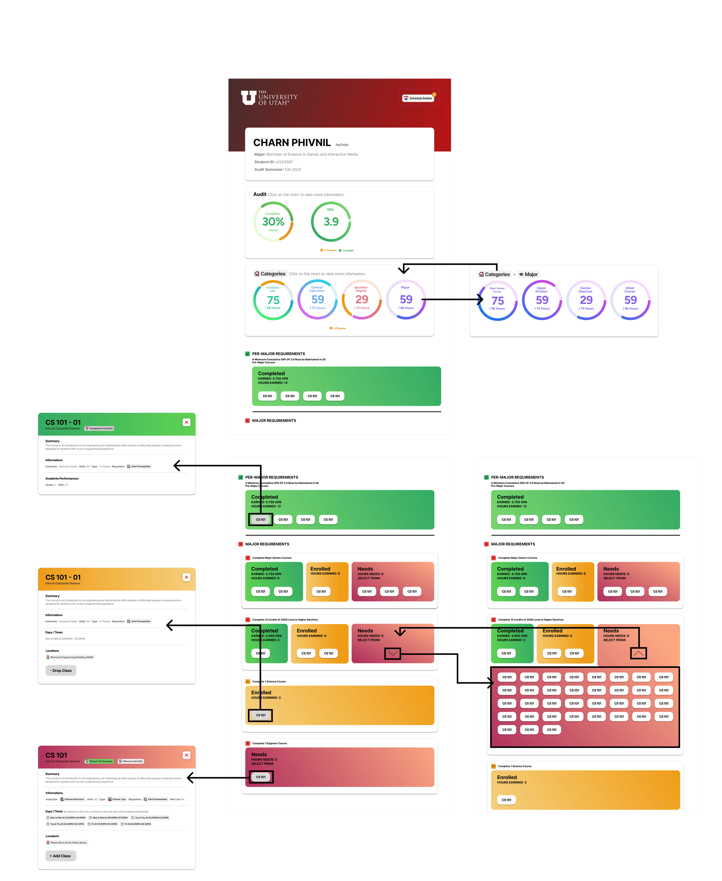
The next step is to redesign the Degree Audit, allowing users to interact with the courses beyond just text.
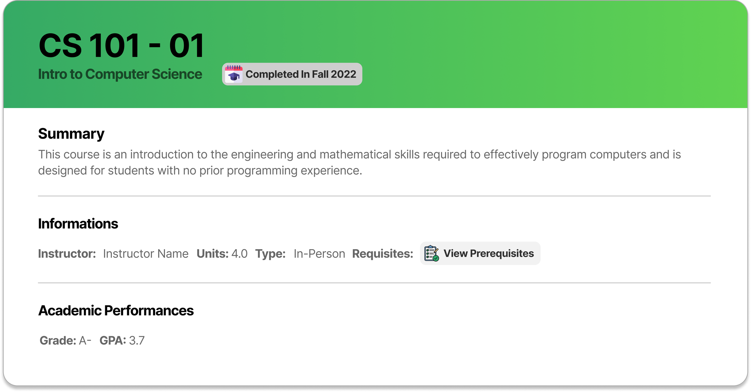
When students interact with the complete class, they can view the date of course completion, academic performance, and course information.
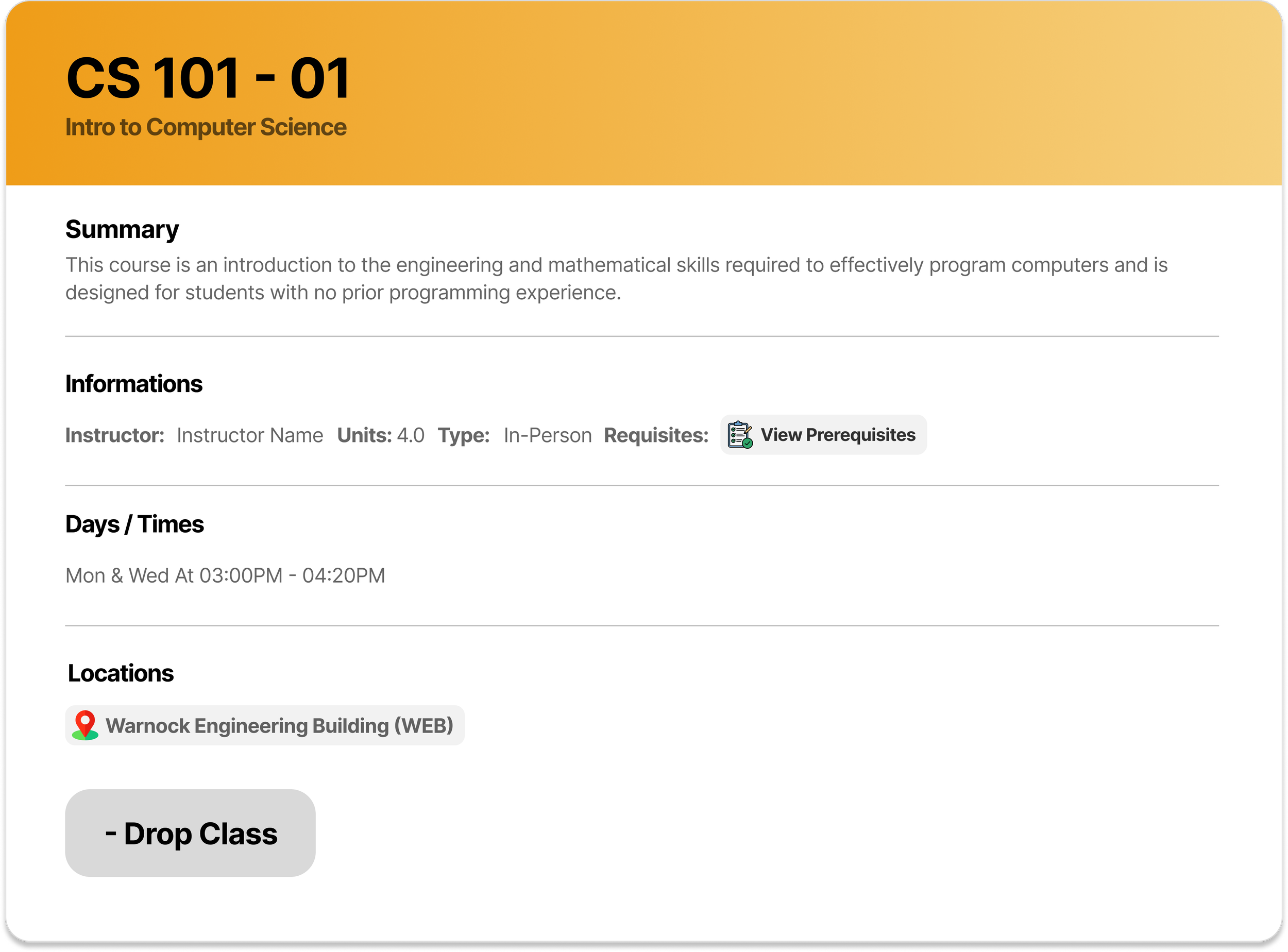
When students interact with the enrolled class, they can view the course information, such as location, days & times, instructor, and more, and they can choose to drop the class.
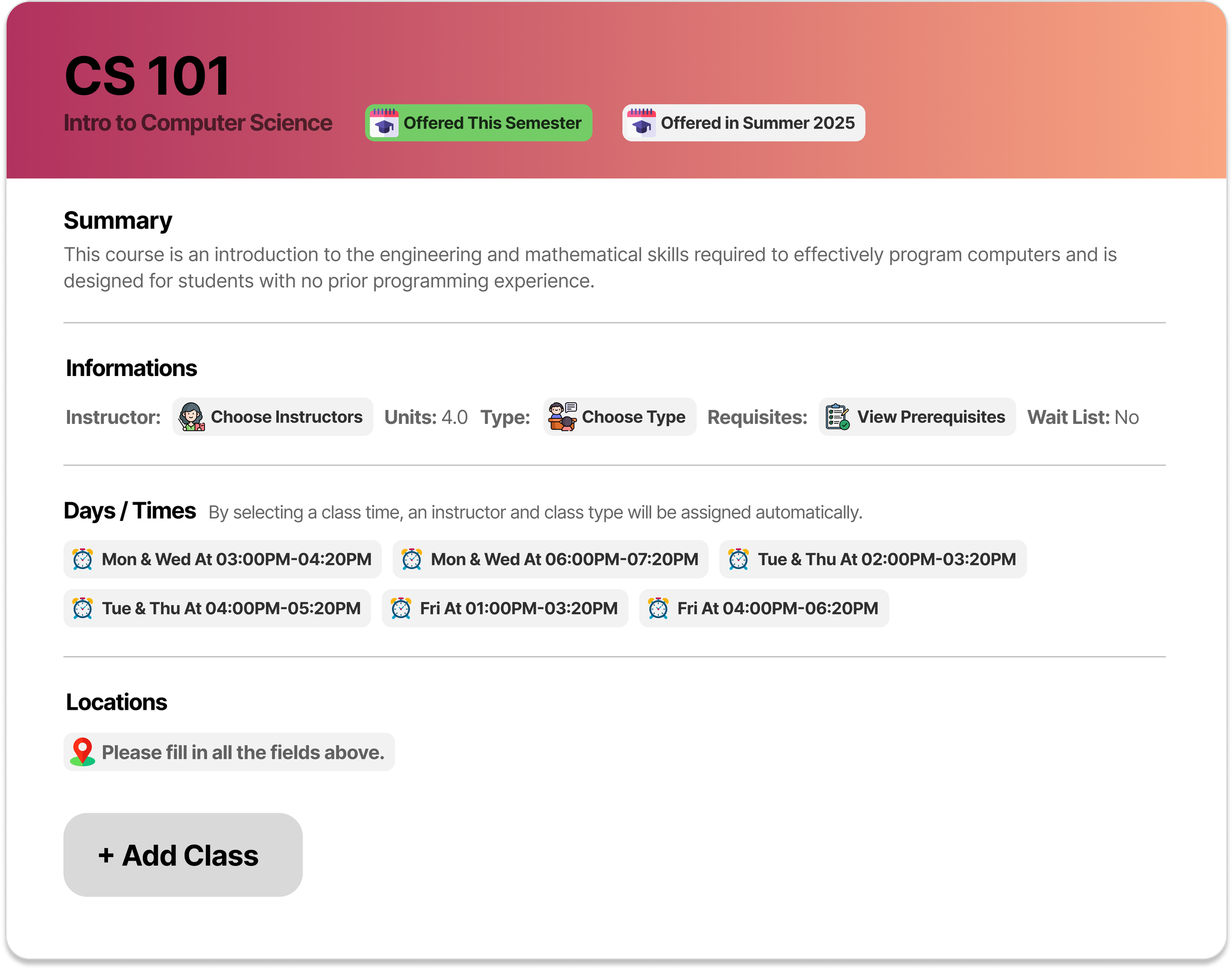
When students interact with the Needed class, they have the option to choose before they can enroll in the course, such as choosing instructors, course type, or selecting their preferred time, which will automatically fill up the information above for them. Students can view when this course is available for them to enroll, which will show up to only three semesters.
With this new design, students can now access all the main functions of the three tabs in just one tab! The last step is to click 'Schedule Builder' at the top right of the page, students can easily finalize their schedule.
Problem: Complexity of Degree Audit
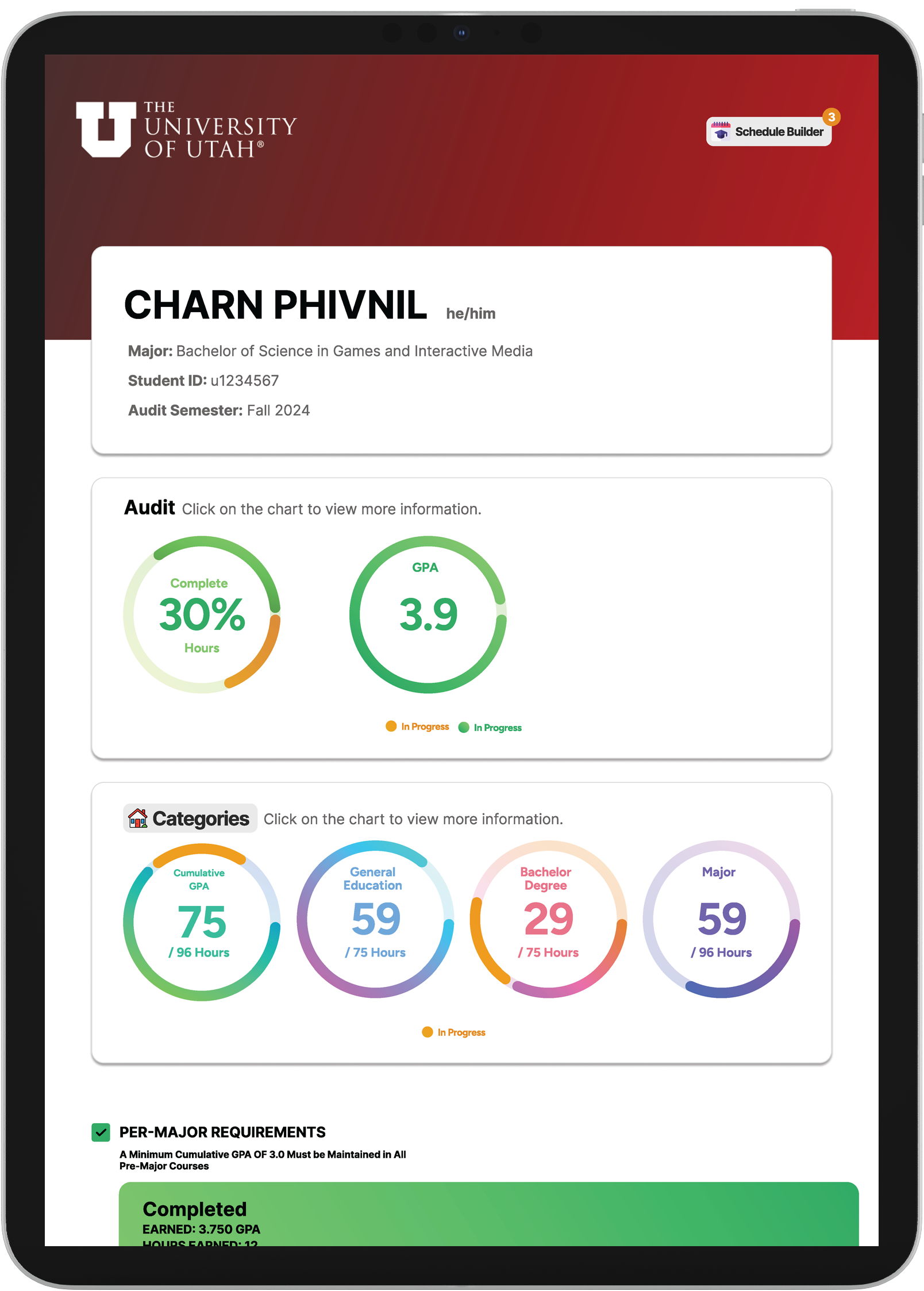
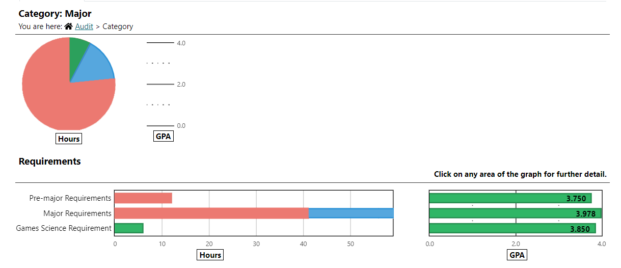
Most of the complexity comes from having only a chunk of text and a lack of visuals. Having some visual elements can help reduce a lot of complexity and make the whole website look cleaner and more appealing to students while keeping all the informations the same.
Before
After
Problem: Psychological Impact of Progress Bar
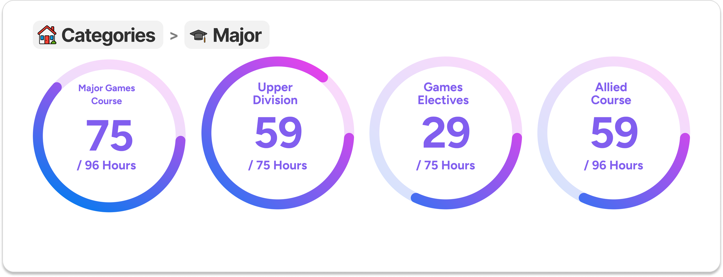
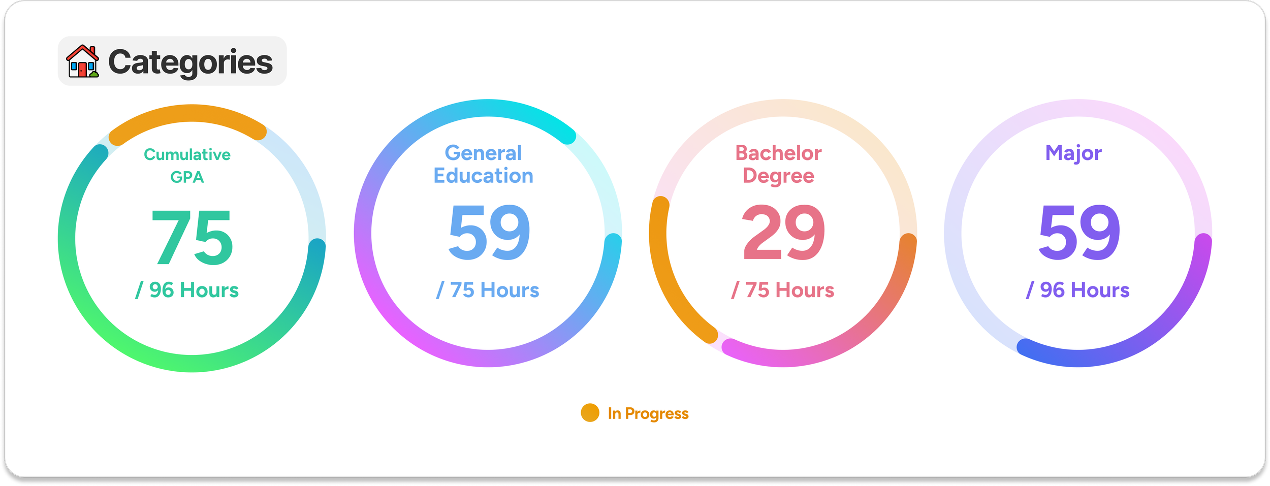
Since red color can in the progress bar can made the students feels like their goal of graduating is very far. The new design will only contains two color the color of the progress bar to separate them into category and a yellow color to represent class that the students are enrolled. Having no red color and just loading progress bar should be the solution for this issue.
>
Home Categories
Sub Categories
Problem: Unnecessary Information
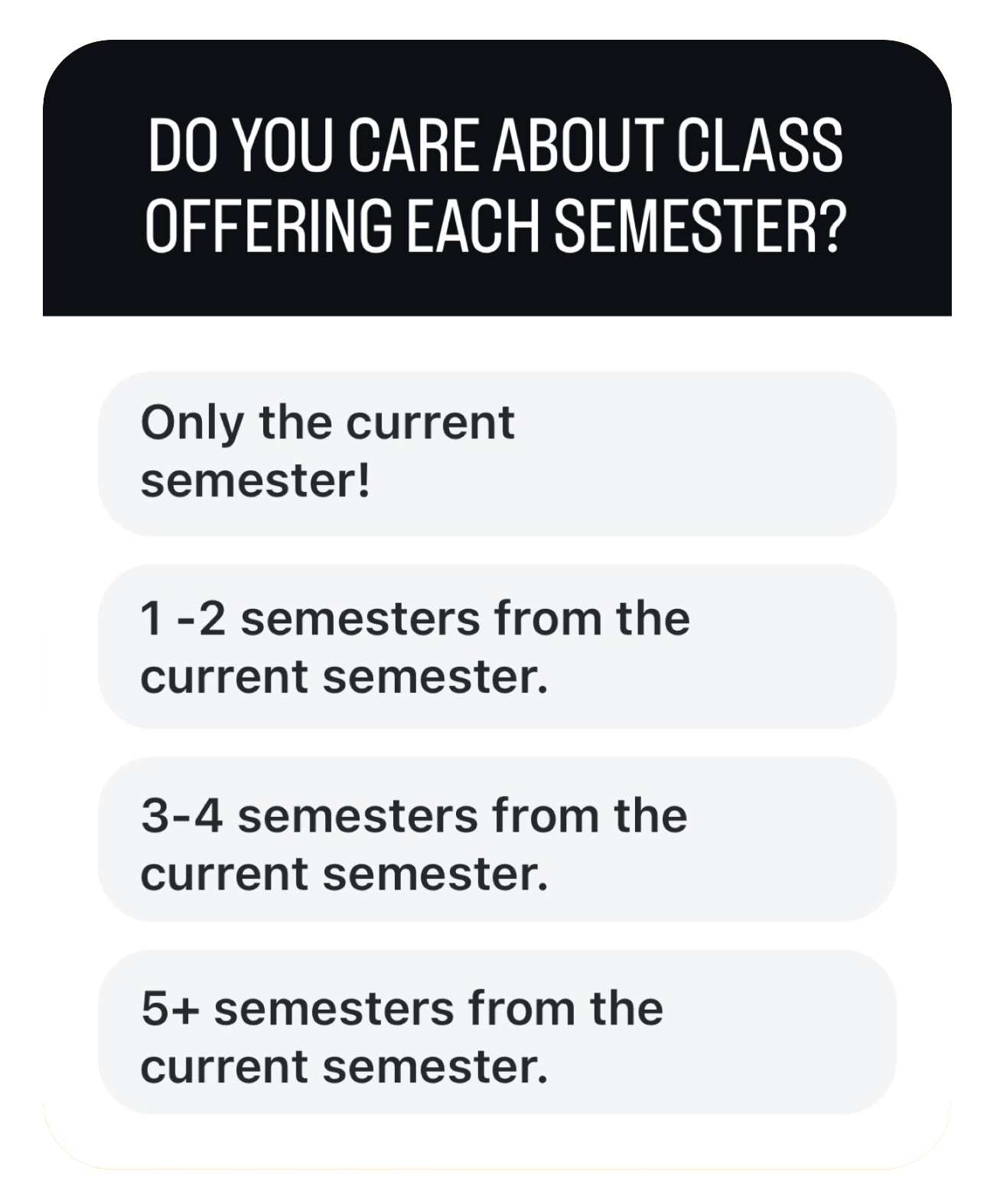
Based on the survey I conducted, 100% of students indicated that they do not care about what classes are offered after 3 semesters from the current semester. Most students when they are enrolling in the class only care about the classes offered in the upcoming semester, while a few students consider classes offered in the following semester.
Testing & Survey
For my survey, I chose to use Instagram Story Polls as the primary method of data collection. While this may seem unconventional, it allowed me to target a specific audience—my followers who are students at the University of Utah. I ensured that only data from University students was collected. This approach proved effective, as it was easy for participants to engage with, resulting in a high response rate and reliable outcomes.
I opted against using platforms like Google Forms because many individuals I know tend to avoid official surveys that require personal information, such as university IDs. By using Instagram's simple, tap-based format, I was able to gather meaningful data in a more accessible and efficient manner.
67
University of Utah Students participated in this survey.
100%
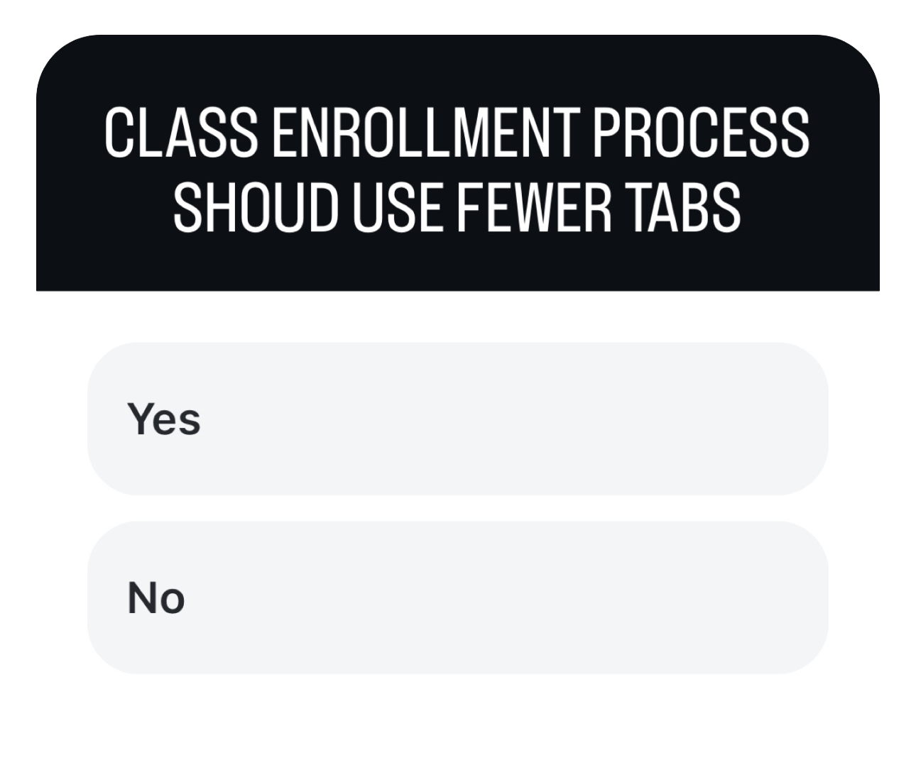
of students agree that the class enrollment process should use fewer tabs.
100%
of students indicated that they are not concerned with class offerings beyond three semesters from the current term.
83.4%
of students primarily focus on the classes offered for the upcoming semester.
56.7%
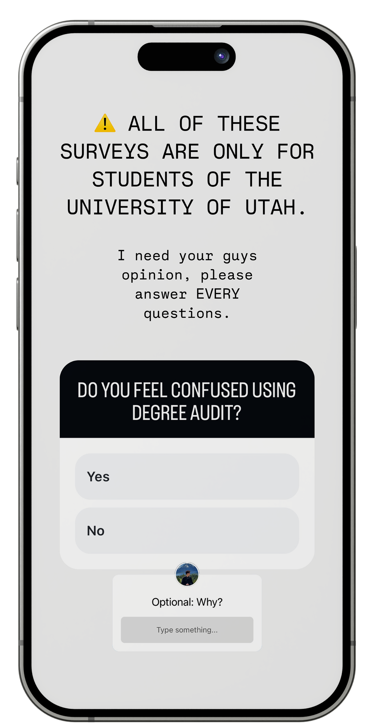
of students feel confused by the Degree Audit due to the cluttered presentation of information.
33.5%
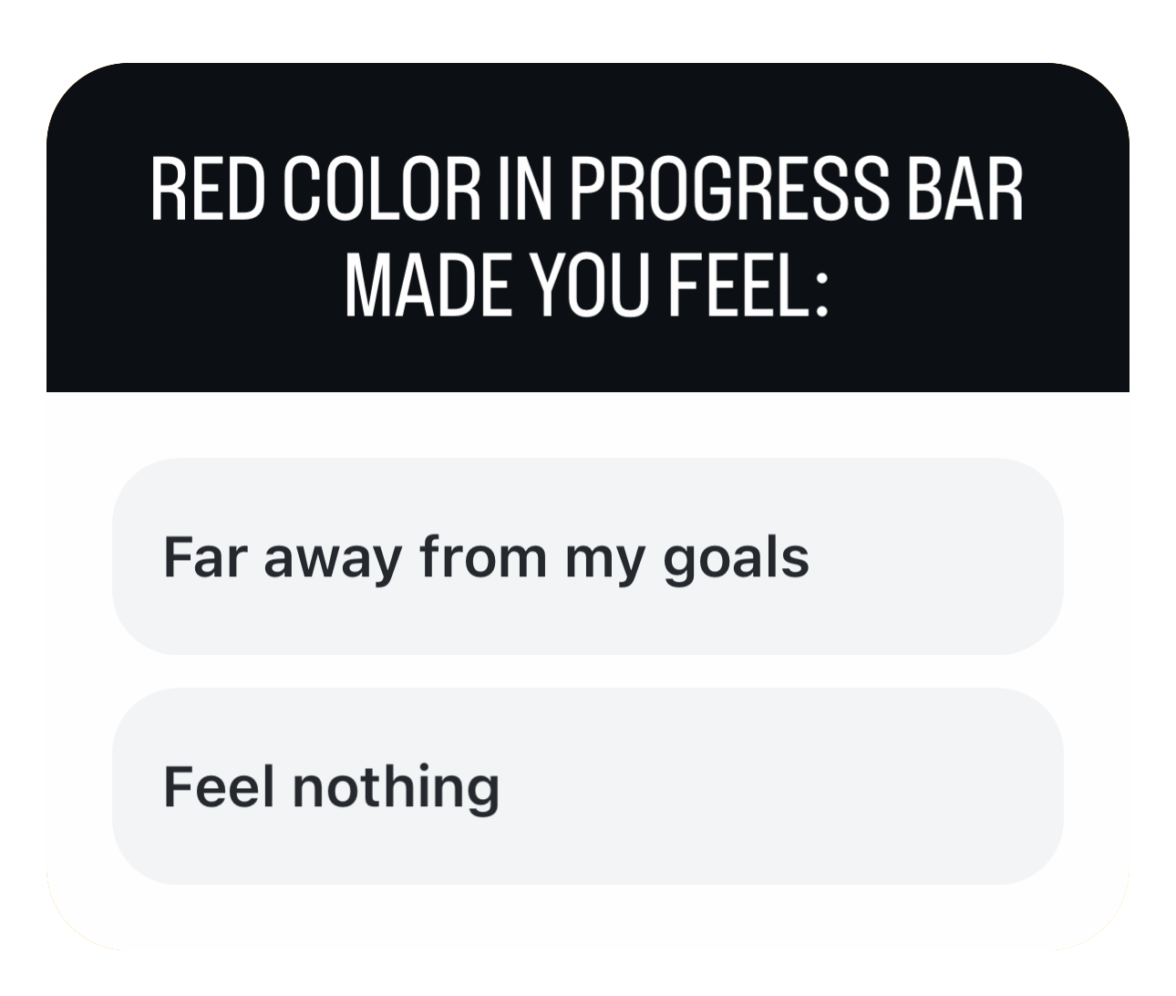
of students feel that the red color in the progress bar gives the impression that they are far from graduating, especially during their first year.
Example of survey questions
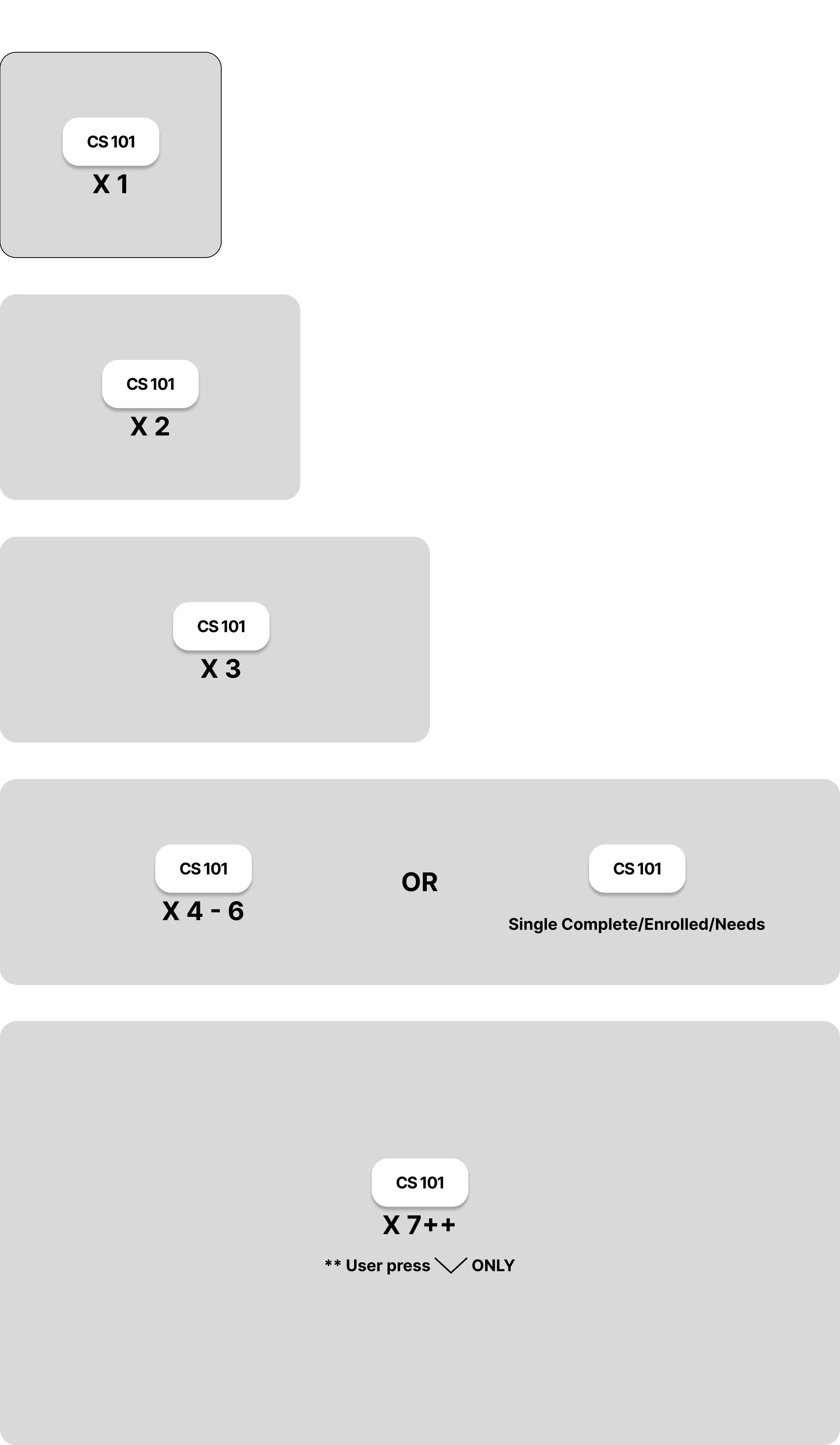
Basic Wireframe
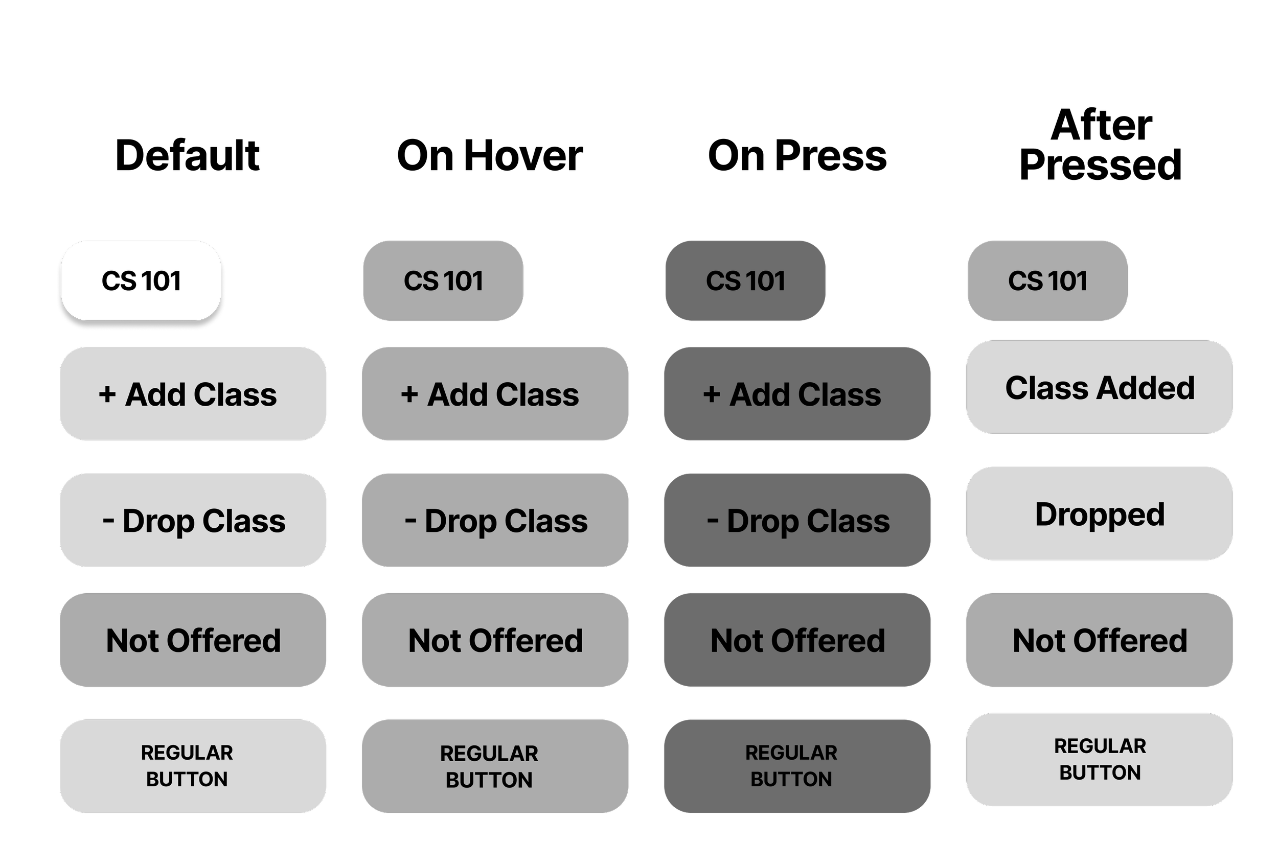
Created and Designed with Figma!

